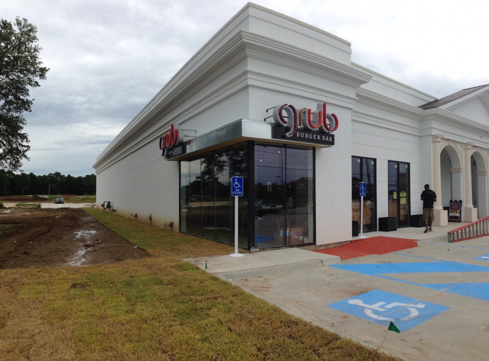
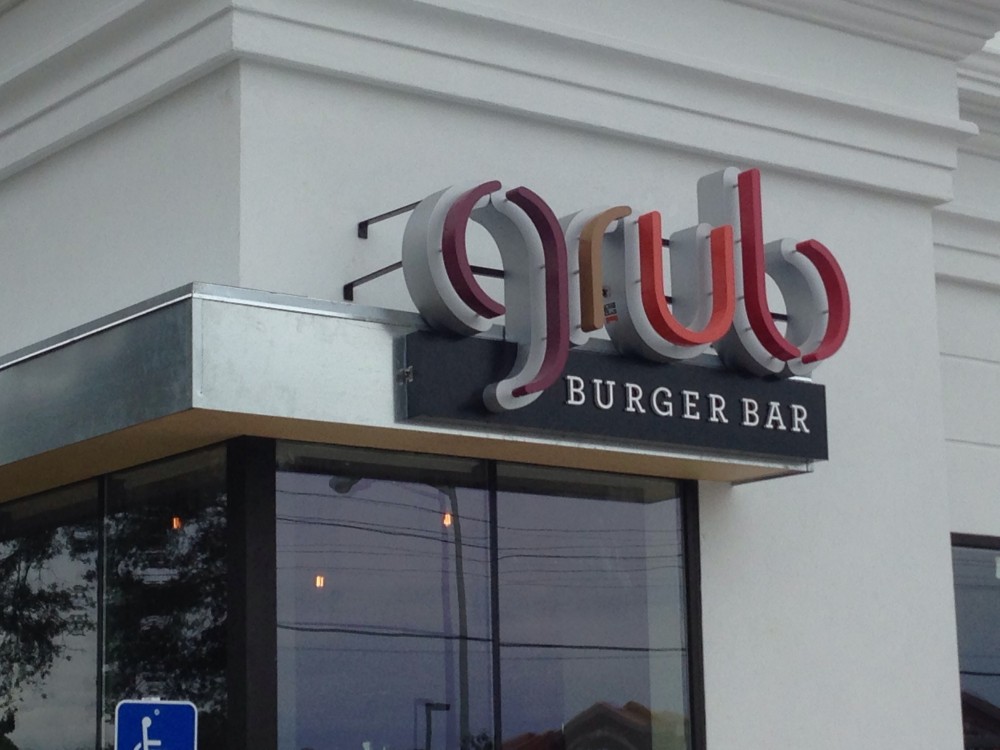
Many of you don’t know me from Adam, but I am a Graphic Designer and I love logos. Grub Burger in my opinion has a pretty legit logo. It is thin typeface that is uniquely “parted” with subtle colors. I also love how many of their stores have the signage on the corner of the building. However, it really comes down to the product and if it is worth the pretty logo. September 9th will be the day to find out. I can’t wait!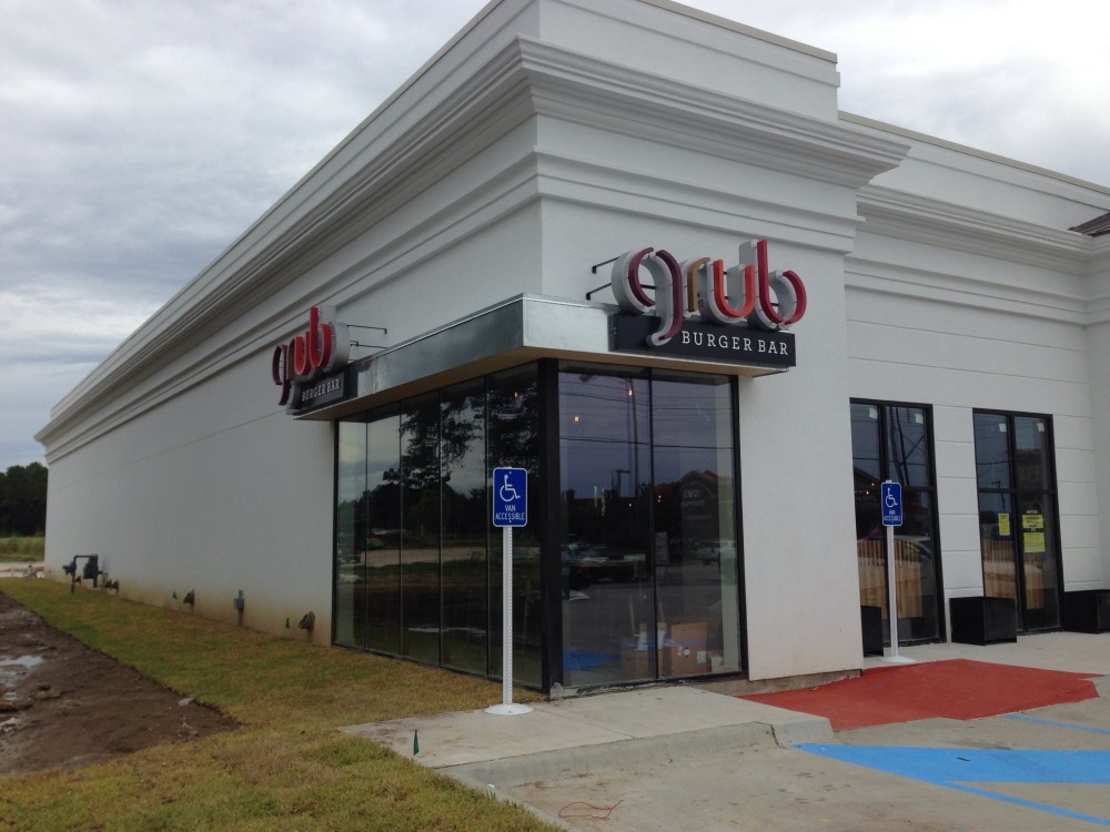
Fast Food Restaurant
Grub Burger’s Sign Is Cool!
on
